MacBook Mockups for FinTech: How to Use a Free Mockup to Make Your Crowdfunding Campaign More Convincing
There’s a moment every FinTech founder knows well. You’ve built something real — a budget management app, a micro-investing platform, a crypto wallet with an interface that finally doesn’t look like a relic from 2008. The pitch deck is ready. The crowdfunding page is filled out. And then you look at it with fresh eyes — and realize: it looks exactly like two hundred other campaigns from this week.
This is precisely where a MacBook mockup changes everything.
Why a MacBook Is More Than Just a Pretty Picture
When it comes to presenting financial products, choosing the right device for your interface showcase isn’t an aesthetic decision. It’s a strategic one.
In the user’s mind, a MacBook is associated with a specific set of qualities: precision, reliability, professionalism. When your financial dashboard is placed inside a realistic MacBook mockup, it automatically borrows those associations. A smartphone signals mobility. A tablet signals flexibility. A MacBook says: this is a tool for serious people managing serious money.
For a FinTech campaign on Kickstarter or Republic, this distinction is critical. Investors and backers make decisions within seconds. They don’t read — they scan. And a MacBook at the right angle, with the right lighting, with your interface inside — that’s a visual argument that works faster than any copy ever could.
The Anatomy of a Perfect MacBook Mockup for a Financial Interface
Not every MacBook mockup serves FinTech equally well. Financial dashboards are information-dense environments: charts, tables, indicators, transaction feeds. Here’s what genuinely matters when choosing:
Angle and Perspective A straight front-facing view delivers crystal clarity — use it when you need the user to absorb the interface details. A slight perspective angle adds depth and a sense of “aliveness,” ideal when you want to convey the character of the product rather than specific numbers on screen.
Device Color Silver for campaigns with a clean, corporate, trust-first message. Space Gray or darker finishes for innovation-driven, tech-forward products. The MacBook’s color sets the tone of the entire presentation before the viewer consciously registers it.
Background and Composition A minimalist white or neutral background doesn’t compete with your UI. Textured surfaces — marble, wood, concrete — add context and emotion, but require care: they shouldn’t turn the mockup into an interior design ad.
Rendering Quality This is perhaps the most important factor. A cheap mockup betrays itself through implausible shadows, flat screen reflections, and unnatural glow. Realistic rendering does the opposite — it dissolves the boundary between mockup and real photography.
Real Examples: MacBook Mockups in Crowdfunding
Let’s see how this plays out in practice.
WealthOS — a personal wealth management platform — used a front-facing MacBook mockup on a light background for their campaign’s main banner. Their portfolio chart dashboard looked like a screenshot straight from Apple’s official website. Commenters within the first 48 hours used words like “polished” and “I already want to try it.” The campaign raised 180% of its goal.
DebtClear — a debt restructuring service — deliberately chose a dark MacBook finish with a perspective angle. Their dark-theme interface on a dark chassis created a sense of technological seriousness. This was intentional: the product handles sensitive financial data, and the visuals needed to communicate security and discretion.
GridPay — a B2B payment automation platform — used a composition featuring two MacBooks at different angles, simultaneously showcasing the admin panel and the analytics module. This visually communicated the product’s scale and versatility without a single word of explanation.
In all three cases, it was specifically the choice of MacBook as the presentation device — not merely the presence of a mockup — that created the right context for perception.
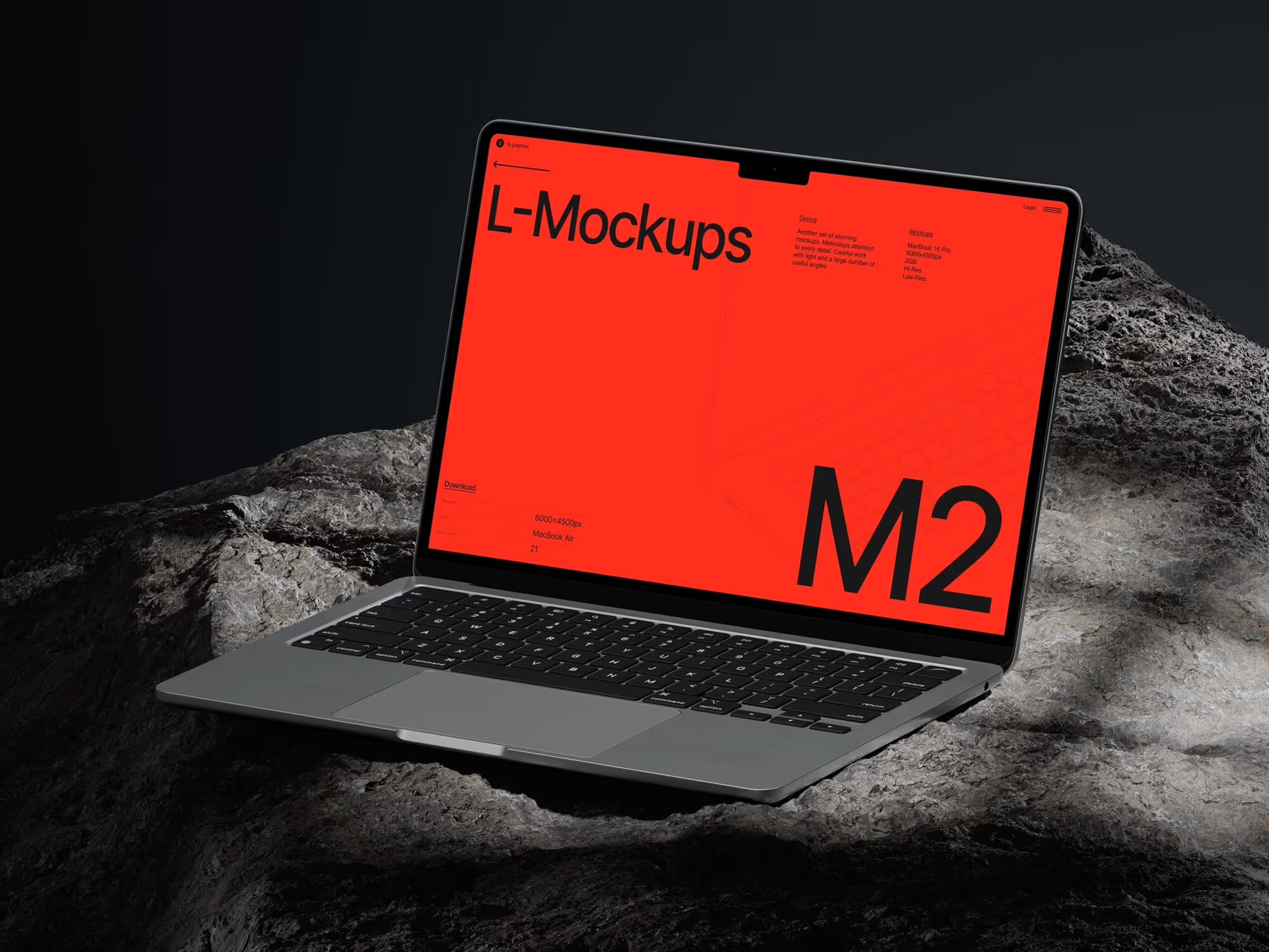
MacBook Mockups on ls.graphics
If we’re being honest about where to find MacBook mockups that genuinely hold up against professional photography, ls.graphics deserves a conversation of its own.
Their MacBook mockup collection is built on several principles that matter especially for FinTech presentations:
- Ultra-realistic rendering — shadows, highlights, and reflections are physically accurate. Your interface doesn’t look “pasted in” — it looks photographed
- Many different angles — front-facing, isometric, three-quarter, top-down. The right perspective for every purpose
- Different device color styles — match the finish to your brand’s tone and personality
- Organized layers — smart objects are structured so that swapping out a screen takes literally thirty seconds
- Stylish minimalistic compositions — backgrounds and surroundings exist to amplify your UI, not distract from it
- Edit Online feature — insert your screenshot directly in the browser, no Photoshop required
- A large number of free scenes — experiment with different approaches before committing to a final campaign concept
One important detail: a free mockup on ls.graphics isn’t a stripped-down demo version. It’s a fully capable asset, ready for use in a real campaign.
How to Properly Integrate a MacBook Mockup into Your Campaign Page
Where and how you place a mockup also shapes the outcome.
The hero banner is the most valuable real estate. Here, the MacBook mockup should take a dominant position, and the interface on screen should communicate maximum product value at a glance. Not a loading screen, not a settings panel — the main dashboard that instantly shows why this product exists.
Mid-page, MacBook mockups serve a different purpose — they illustrate specific features. This is where different angles earn their place: different sections of the interface, different perspectives. A three-quarter angle or isometric view often delivers more here than a straight-on shot.
For social previews and ad creatives — go front-facing, maximum cleanliness. It holds its meaning even at small sizes without losing clarity.
Conclusion
A MacBook mockup is not a decoration for your crowdfunding page. It’s a communication tool that shapes how your product is perceived before a backer reads a single word of your pitch.
For FinTech, where trust is quite literally the currency, a well-chosen and well-placed MacBook mockup can shift how investors perceive the maturity and seriousness of your product. Start with ls.graphics — and see for yourself that the quality of your presentation and the quality of your product are, in the eyes of your audience, completely inseparable.